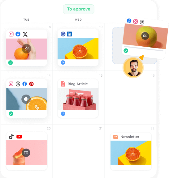
Pallyy lets you schedule social media posts through a super user-friendly interface, while its content queues are useful for planning series of cross-network posts ahead of time. But its add-ons can bump up the price by a lot (add-ons which are otherwise available by...
Planable
Brand Guidelines
Your go-to resource for using Planable’s brand assets correctly
Logo
wordmark
& symbol
Use the primary logo whenever the background provides good contrast for clear visibility.
If the background clashes with the logo colors, use the monochrome version (light or dark) that ensures the best contrast and readability.
The symbol should be used only in small-scale scenarios where the full logo is impractical or not feasible.
What to avoid
Your go-to resource for using Planable’s brand assets correctly
Do not modify or stretch the logo for any reason
Do not outline the logo or the symbol
Do not recolor the logo, even using brand colors
Do not apply shadow to the logo
Do not rotate the logo or place it in other positions than horizontal
Do not readjust the propotions between the symbol and wordmark
Do not move any of the logo's elements
Do not switch the order of the colors in the symbol
Make sure there is always enough contrast for all elements
Do not place the logo on busy backgrounds
Our
colour palette
Planable’s color palette is designed to be bold, modern, and approachable, reflecting our brand’s collaborative and dynamic nature.
The combination of vibrant blues, purples, and warm accents creates
a dynamic yet balanced look across all brand materials.
Sunset Peach
#FF9052
Lavander
#8180FD
Tropical Mint
#21CC99
Sky Breeze
#83AEFF
Coral Brush
#FF5F5F
Planable in action
Take a quick tour to get a better sense of Planable